KUNSTSAMMLUNGEN UNI BOCHUM / ART COLLECTION – UNIVERSITY OF BOCHUM
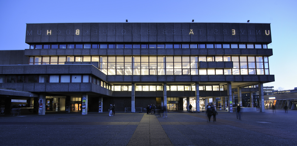
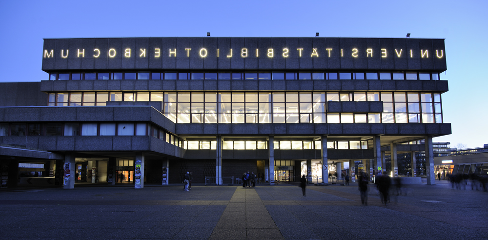
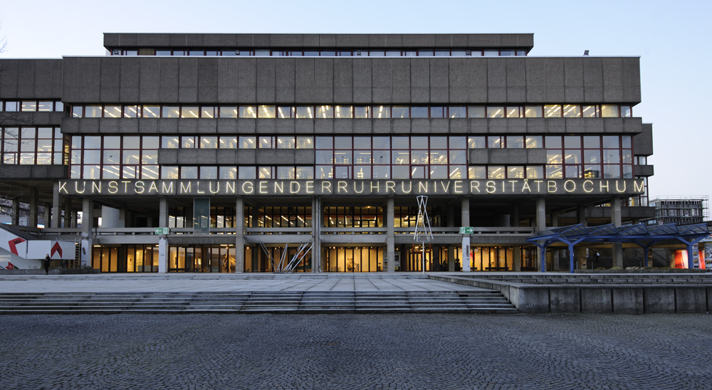
Everyone has experienced the irritating flicker of neon signs — individual letters go out and the once clear message becomes incomprehensible. Mischa Kuball makes use of this common issue in his light installation at the Universitätsbibliothek in Bochum.
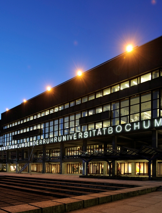
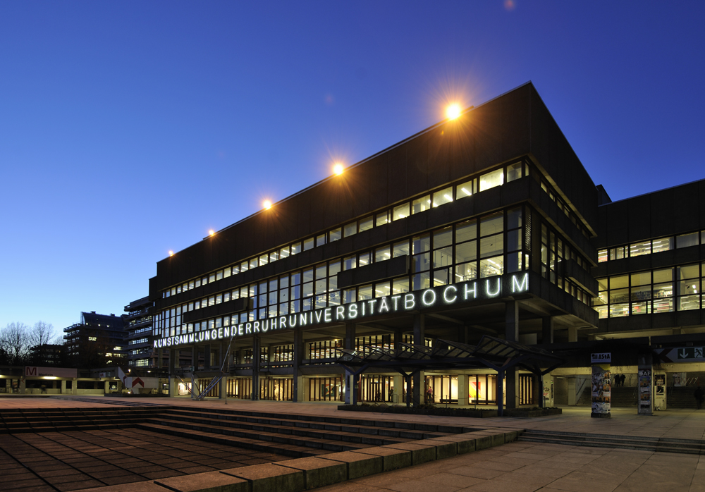
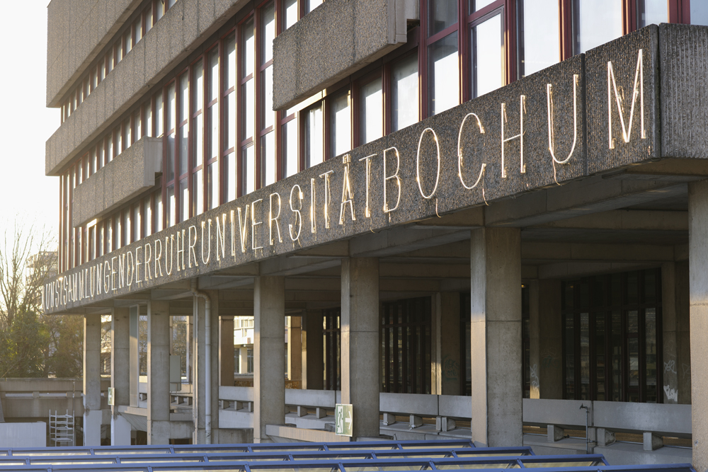
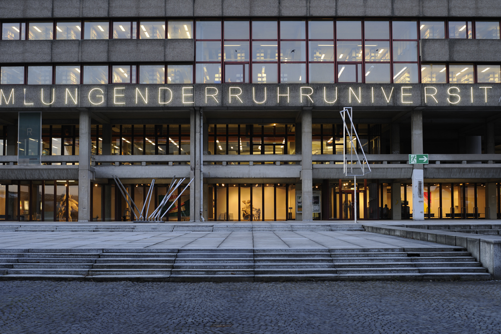
Along the south facade of the university library, the artist installed a neon sign that reads: “KUNSTSAMMLUNGENDERRUHRUNIVERSITÄTBOCHUM,” which translates to “ARTCOLLECTIONOFTEHRUHRUNIVERSITYOFBOCHUM.” Written without spaces in a font based on Latin capitalis, the letters glow at night and are barely visible during the day. However, it’s rare that the entire text can been seen at one time. Usually, only seemingly random constellations of letters are lit up, creating a puzzle for the viewer.
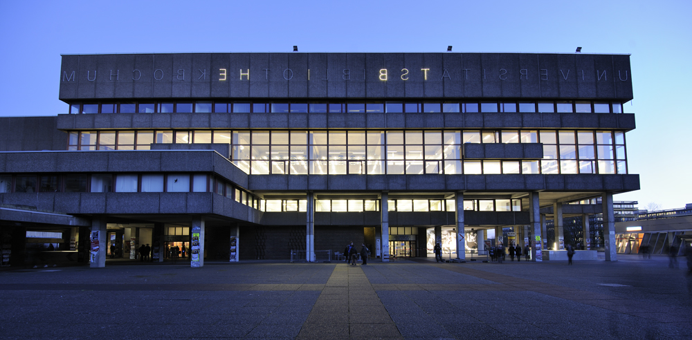
This installation was incorporated in 2003 as one of the more recent works in this Kunst-am-Bau ensemble and the Ruhr-Universität expanded it in 2005. The second neon sign reads: “UNIVERSITÄTSBIBLIOTHEKBOCHUM,” or in English: “UNIVERSITYLIBRARYBOCHUM.” This text lights up the library’s north facade and must be read backward as a mirror image.
By only installing the text forward (right to left) on the south side of the building, the artist draws attention to the original plans for the entrance, which was going to be where the art collection is currently located.
In this way, the light installation makes reference to when the building was being designed. The Latin capitalis font refers to its function as a place of humanistic education. The inverted doubling of the text creates a sort of bracket that summarizes the location in terms of form and content.
Additional information: www.artibeau.de/1501.htm
Mischa Kuball
← Zur Startseite
Bochum, Ruhr-Universität, facade of the Universitätsbibliothek, Universitätsstraße 150